With so many books to choose from, how do you decide which book to take down from the library or bookshop shelves? Is it the cover? The title? The publisher’s blurb? Or do you only go shopping for a book on the recommendation of a review or from a friend?
The following books by Australian women were all released in 2016. Because their surnames come toward the end of the alphabet, they are most likely to appear at the bottom of your bookshop’s shelves.
If their covers were displayed prominently somewhere, which would you be most likely to pick up? Can you tell the ones from big publishers from those that are self-published? I’d love to know.

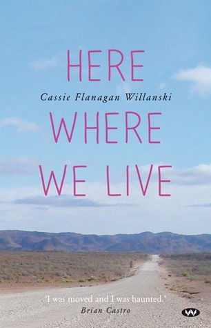
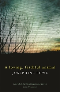
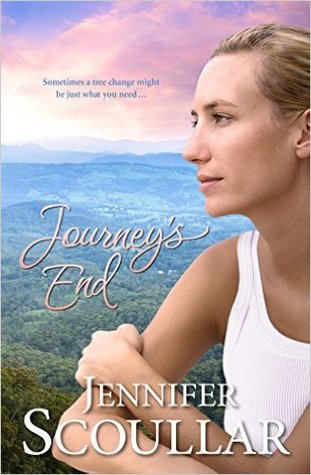
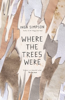
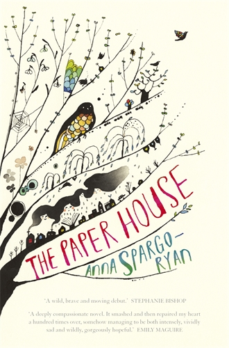
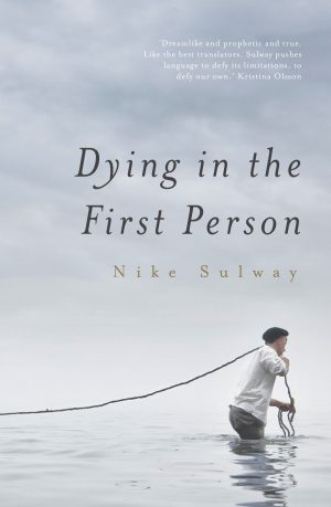
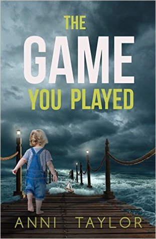
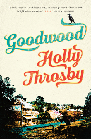
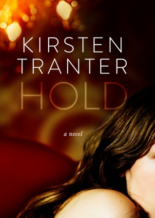
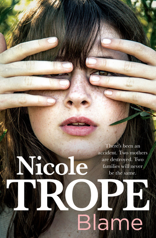
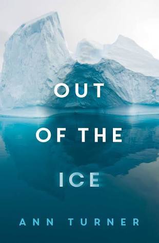
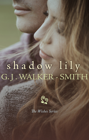


I unashamedly choose books by their cover – doesn’t mean I always buy/read but something has to catch your eye and publishers know this, hence the strong association with certain kinds of graphics to particular genres (remember when chick-lit became a thing in the 90s and every second book had a hot pink cover and a pair of shoes?!).
So, being a contemporary literature lover, I’d be picking The Paper House, Goodwood, Where the Trees Were and Here Where We Live from the covers you’ve featured. I’d pretty much by-pass any covers with a photograph of a person on the cover – instinct tells me they’re romance or popular fiction which doesn’t interest me much.
That’s really interesting, Kate, and thanks for commenting. Seeing Kathryn’s reply below, I’m wondering if a lot of readers are turned off by people on the covers. One thing I’ve noticed is how many contemporary books by Australian women show a woman’s back. It’s becoming a cliché.
On cover alone, I would choose Inga Simpson’s book. I tend to dismiss covers featuring photos of people. I make assumptions about these books that I can’t articulate. That they will be trashy? That is so unfair. They probably aren’t.
That’s fascinating, Kathryn, as Simpson’s book has another cover (with human figures) and I chose this one for preference. What if the human figure is stylised? I’m thinking, for example, of different editions of Robyn Cadwallader’s The Anchoress: the Australian edition shows a bird (which I loved) and others have a depiction of a woman.
I agree with you Kathryn. Also I can’t exactly say why but I think they imply a trait or theme which the book may or may not follow, which is a kind of spoiler either way.
I think a good book is deserving of a good and well thought out cover.
Who would go out and try to sell themselves or anything they love without first dressing appropriately and putting on some ‘tasteful’ makeup?
I have a particular dislike for covers featuring girls in cowboy hats…which usually has no bearing whatsoever on the story within and more often than not [to my mind] sells the book short.
Inga Simpson’s book Where The Trees Were is a wonderful example of a book who’s cover has been given the respect it deserves.
What do you think of this version of Where the Trees Were? http://australianwomenwriters.com/wp-content/uploads/2016/08/SimpsonTrees.jpg
Nowhere near as much, and it would put me off. I have seen the other cover many times and I’ve fondled it, nearly bought it, but not yet. No time to read it. I don’t really buy books by the cover, but this example shows me that certain covers – those that are a bit edgy, that aren’t “yelling” something at me, that look a bit “arty” or subtle – will attract my attention.
I’ve read three of the books you’ve displayed – the Rowe (review going live tonight), Spargo-Ryan and Wilanski. I particularly love the Spargo-Ryan cover. Of the ones I haven’t read the two that appeal are the Simpson and the Sulway.
I don’t like this cover nearly as much and would be less likely to pick it up. What fickle visual creatures we are.
I passed by the five with women’s pictures (they look like romance novels) and skipped A Loving Faithful Animal because of the title. I picked up all the others (by following the links) and read the blurbs and eliminated The Game You Played and Out of the Ice.
If I were really in a bookstore I would take the remaining five to a cozy corner and read a few pages of each. I would probably buy Here Where We Live (why doesn’t the cover indicate that it’s a story collection? that would have grabbed me right away.) and Dying in the First Person unless the writing turned out to be dreadful. And maybe the other three too–they have the most appealing covers of the twelve.
I’m not familiar with any of the authors so that didn’t affect my choices.
Thanks, Martha. This exercise is proving to be illuminating. I can’t vouch for Here Were We Live, but I can highly recommend Dying in the First Person. Sulway is an award-winning writer and I don’t think you’d be disappointed in the quality of her prose.
Good comment about Here where we live, Martha. Maybe its because short stories are not known to sell well so they want to grab people’s attention, to get them to look at the book. It’s a good read BTW. And. I’m interested in your rejecting the Rowe because of the title. Why? Because you think it’s an animal story? In fact it’s not (thought there is an animal in it briefly) – my post on it will be published tonight.
I did think “animal story.” I’ll check in later and read what you have to say about it. Thanks for the news!
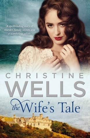
I love books with women on the cover, especially the way “The Wife’s Tale” is done. I will pickup any book about families. My first choice would be “The Wife’s Tale”, “Journey’s End” & “Blame”. I’d also pickup “The Game You Played” as it looks like a thriller. I rely a lot on authors I know or those I’ve heard about, like Inga Simpson even though I don’t like the cover of “Where the trees were”.
I probably wouldn’t look at any of the others but funnily enough I have “Hold” on my shelf to read and also a G.J. Walker-Smith novel and I will probably enjoy them.
Great to know the publishers are getting it right for some, Veronica! I think you’re right about The Game You Played (though I haven’t read it). I see no one seems to have picked it as self-published.
I read plenty of books-with-women-on-the-covers, Australian rural romance and so on (as I read in pretty much all genres, to some extent). I don’t pick these books up based on the cover, however, I pick them up based on authors I already love or recommendations from people with similar tastes.
The issue I have with these covers is that they typically communicate nothing other than a clue to the genre. There’s a generic photo of a woman, whose physical features may or may not even match the description of the protagonist; and a bit of random Australian landscape. I do wish they were made a little more carefully.
Based on the covers alone in this post, I’d pick up Where the Trees Were and The Paper House. I may well read some of the other books, but the cover isn’t what’s attracting me.
Thanks for commenting and you’re making me think, now. I wonder if the generic covers are a low budget option?
I should think so – they’re often two stock images pasted together with a bit of Photoshop and typography, and no original art. And don’t get me wrong, I think that communicating genre is a very important function of a cover! I just would like … more. Ah well.
Great post Elizabeth. I wonder if any publishers have seen it.
I love posts like this! In a bookshop, presented with books by authors you have never read, it has to be a cover which makes someone pick a book up to see if subject matter might interest, and, more importantly, a bit of a read to see if the author’s voice appeals. Like many here, I make negative judgements about photos. In fact, I like covers which are a little illusive, elusive, and suggest to me that the content might therefore be subtler, and the writing more layered. I like a sense of spaciousness in graphics – so a loving faithful animal and Dying in the first person caught my eye first. They also suggested, by the type face, and the way things were arranged, that these were professionally published. So someone had thought them ‘good south’s. I also like a complex cover which seems as if it might be full of hints and subtext – The Paper House. A very busy cover, but appealing. As was the fact that the title didn’t quite tell me what it would be about, and neither did the picture. It suggested it was lit fic, not genre, and as a lit fic, not genre reader, it got me. That would have been the one I would have had to pick up for sure. Title and cover told me nothing obvious, so, suggested a reading adventure – maybe I would find treasure!
Thanks for taking the time to comment. It’s so interesting to read what captures readers’ imaginations. I haven’t read The Paper House, but I can certainly recommend A Loving, Faithful Animal and Dying in the First Person, both powerful – and very different – reads.
I do have books on my shelves and have read books that have women on the covers, but I don’t feel drawn to those covers.
From your selection I have read Where the Trees Were & Hold. The cover definitely drew me to the Trees, but I read Hold because I have met the author.
Goodwood & The Paper House appeal thanks to the cover. I dismissed Here Were We Live because of the outback cover when I first read this post, but have since read a couple of positive posts that suggest it’s my kind of read after all.
Covers count, but not completely 🙂